03 Rare Planet — website redesign, 2024
All workA clearer home for Indian handicrafts
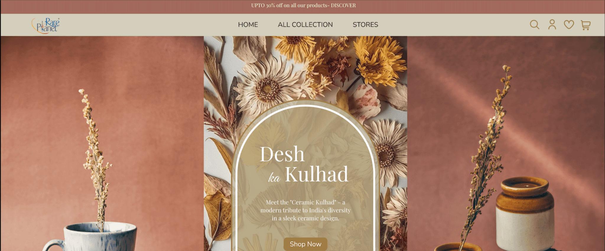
A homepage redesign focused on clearer hierarchy, simpler navigation, and easier product discovery.
- Role
- Visual Design Intern
- Focus
- UX AuditRedesigningPrototyping
- Scope
- Landing page redesign
01 Overview
Handmade products, told simply.
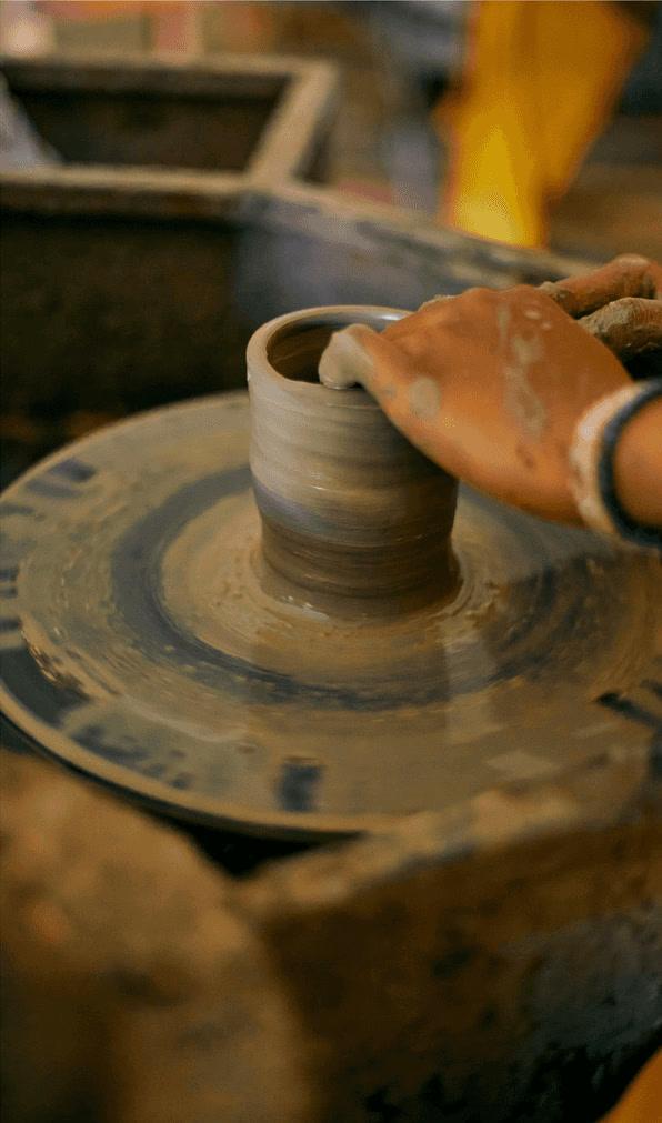
Rare Planet is a retail lifestyle startup launched in 2017 which promotes and sells Indigenous Indian Handicrafts in offline and online markets, along with giving a sustainable income to local artisans. They sell handmade kulhads, bowls, kettles, copper bottles, and mugs, all hand-painted by local artists.
My design approach for the website was to create a clean and modern interface that showcases the company's product line and highlights their unique features and benefits. I used high-quality visuals and interactive elements to engage visitors. I also worked closely with the Rare Planet team to ensure that the website was user-friendly and accessible to all visitors, regardless of their level of technical expertise. I incorporated clear calls to action and streamlined navigation to help visitors easily find the information they need and make informed purchasing decisions.
02 Existing website
Where it started.
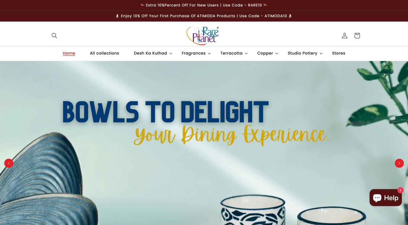
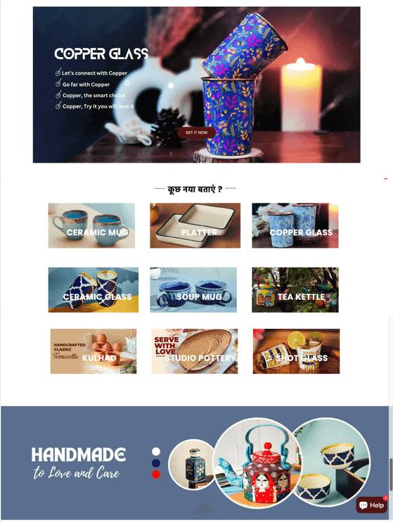
These screenshots depict the former website, which suffered from significant design flaws, such as a disorganized layout, limited user interaction, too many fonts, and challenging navigation. It lacked visual appeal and failed to capture attention effectively.
03 Problems identified
Eight things getting in the way.
- 01
Lots of unnecessary space has been used for the header section.
- 02
Too many colours have been used, which can be overwhelming and distracting for the users.
- 03
More than four fonts have been used in the website, which shows inconsistency.
- 04
Lack of proper categorisation of the products.
- 05
Gaps between sections are not consistent.
- 06
CTA buttons are not clearly visible.
- 07
Banners are very busy and distracting.
- 08
Three different animations used on the home page.
04 Design goals
Calmer, clearer, easier to shop.
The job of developing an attractive website with easy-to-use navigation to draw in more clients was needed. It was ensured that the redesigned website matched the brand's identity and guidelines.
- 01
Simplify and unify the visual language.
Reduce the color palette and typography to a consistent system (fewer than four fonts, a defined color scheme) to eliminate visual noise and reinforce brand identity.
- 02
Streamline layout and spacing
Remove excessive whitespace in the header and fix inconsistent gaps between sections to create a more balanced, professional rhythm throughout the page.
- 03
Improve content structure and findability
Introduce clear product categorization and calmer, more focused banners so users can scan and locate what they need without visual overload.
- 04
Strengthen usability and conversion paths
Make CTAs clearly visible and reduce competing animations, so user attention is guided rather than scattered, improving both navigation and conversion.
05 Fonts & colours
Fonts & colours
- White#FFFFFF
- Black#121212
- French Gray#D4CEBE
- Dark Muted Gold#A17C48
- Dusty Terracotta#A3695C
- Playfair DisplayHeading
- Nunito SansBody
- Great VibesAccent
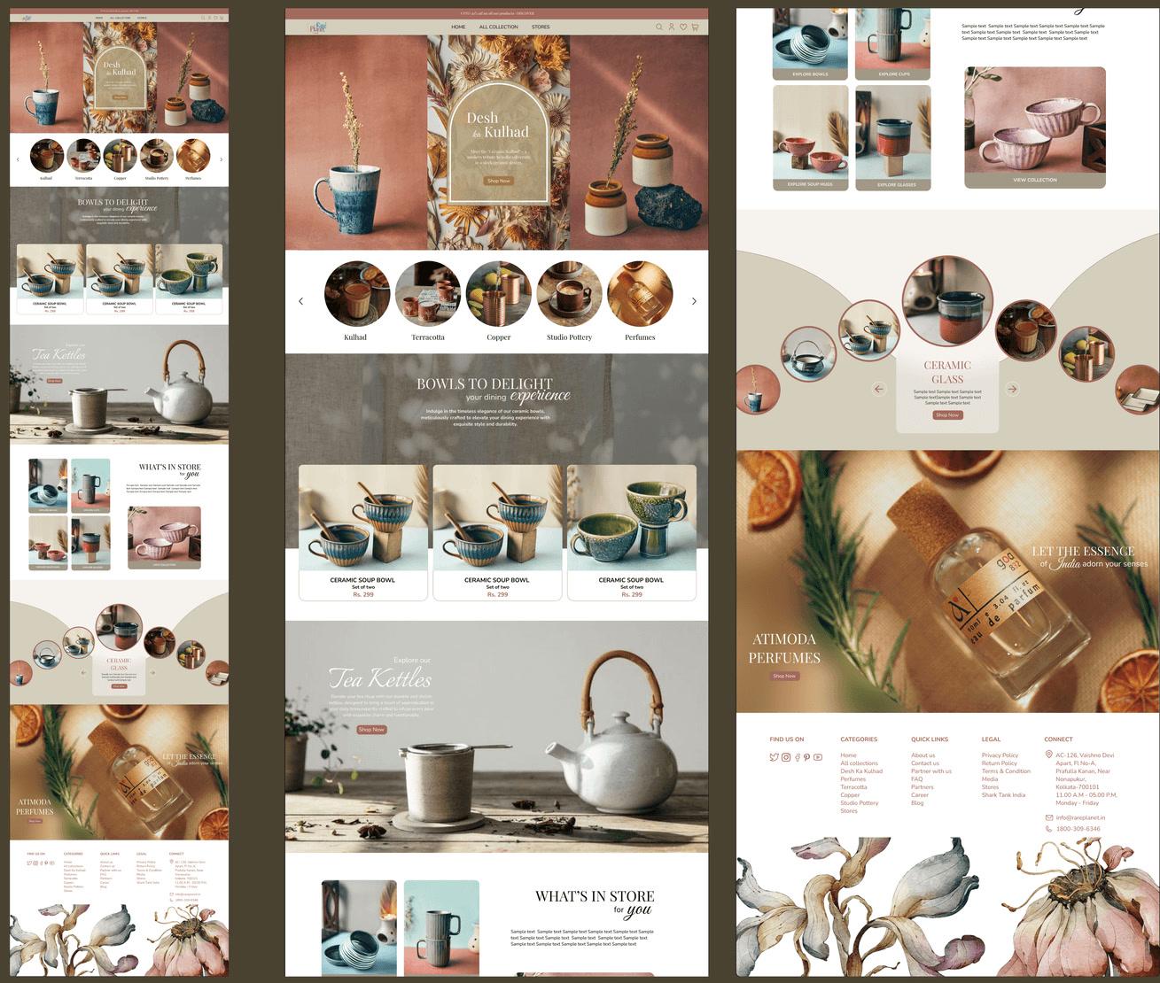
06 Final landing page
The redesigned homepage.
07 Solutions
Eleven decisions, top to bottom.
- 01
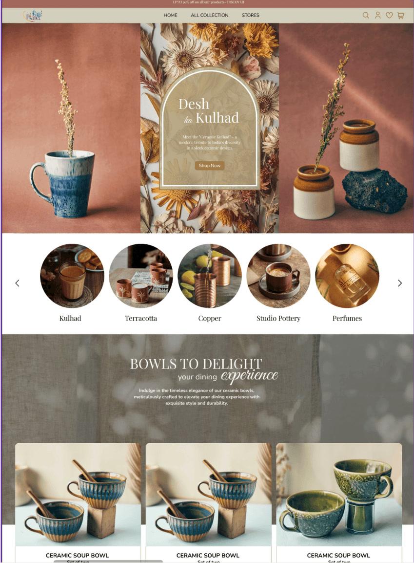
A marquee on the header to attract customers with lucrative offers.
- 02
Simplified the number of options, putting only the primary options in the header to avoid confusion.
- 03
Moved the search bar from left to right to place it in proximity with the other icons.
- 04
Used a simple and more contrasting banner for the hero section.
- 05
Moved the extra options from the header to here for a more interactive experience and a clean, intuitive user interface.
- 06
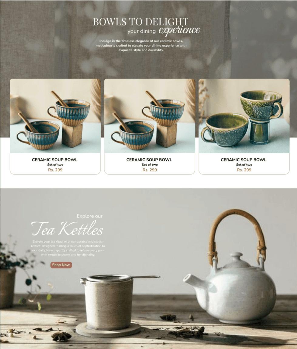
Created a section for their most popular and bestselling product in a banner style.
- 07
A dedicated section for their all-new category of handmade kettles.
- 08
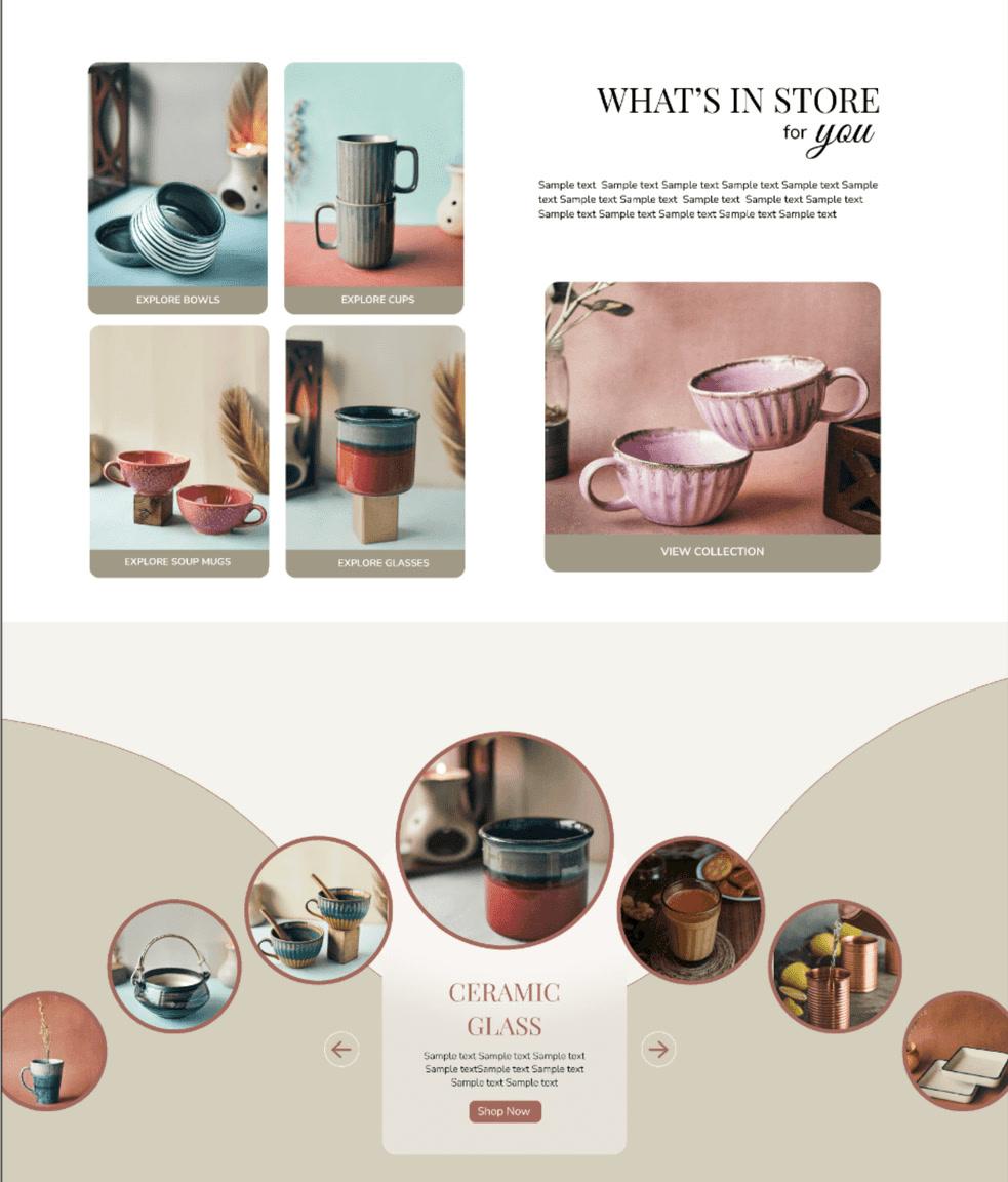
A section for their ceramic product categories.
- 09
An interactive categorisation of products to maximise the user experience.
- 10
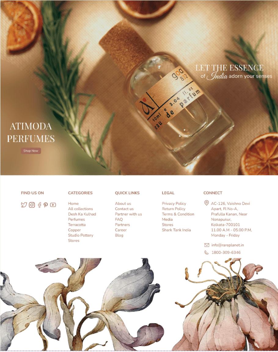
Added a section for their perfume brand Atimoda at the bottom of the landing page, as it is not the primary product of Rare Planet.
- 11
Made the service detail page simple yet visually appealing through the primary brand colour for the font, balancing the white space with hand-painted flowers.